
In regards to restricting paint colors, the Texas Main Street Center does not have a required list and does not encourage cities to make a required color palette as it limits individuality and color appropriate to different building styles.
It is the position of the Texas Main Street Center (TMSC) that having a specific color palette for a historic district is not recommended. It is best to evaluate color on a case-by-case basis. Not every building should be painted the same color, and not every color is suitable for each building. Consider the following:
- Your city will have a variety of buildings from different time periods; Art Deco color schemes differ from Victorian color schemes.
- While a color may be totally appropriate for a small portion of a building, for example on wooden trim or accents, it may be inappropriate when chosen for the base or main body color of a building.
- Natural brick and stone colors are recommended when painting brick that has already been painted* so that appearance of natural brick is maintained. When the TMSC suggests colors to repaint brick that has already been painted, we often try to go back to the same shade as the original brick. The original brick color can be discerned by examining peeling areas of paint where the original brick is exposed, or by using historic photographs to estimate the tone based on the lightness/darkness observed.
- It is also important to consider the surrounding buildings when painting each building (both trim, and base colors) to create a more harmonious block. This is not to say that each block should ‘match,’ as this is not recommend either. Color is a very personal choice, and also one of the easiest things to change on a building. Evaluating each building owner’s chosen colors for appropriateness based on the individual situation, building and business is recommended.
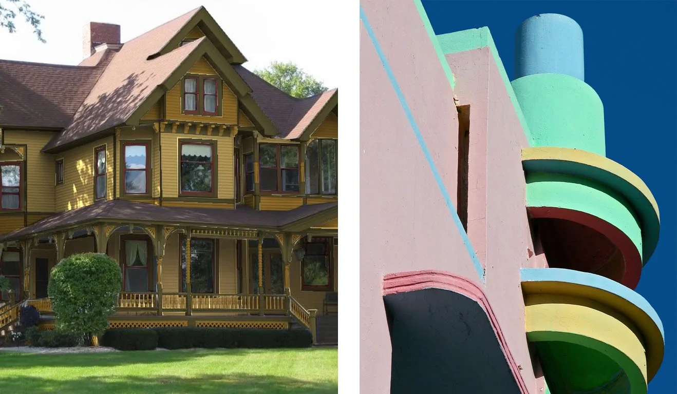
Victorian (left) vs. Art Deco (right) color scheme. Note how drastically different the colors are; both are appropriate for the building they are painted on. Often times a restricted color palette will exclude the brighter colors that are appropriate to the more modern styles such as Art Deco.
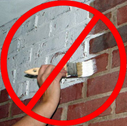
*NOTE* - The TMSC does not recommend or approve of painting unpainted masonry, as it will provide an ongoing and unnecessary maintenance issue and takes away from the historic integrity. Painting brick can trap moisture in the brick, as brick needs to be able to breath, and can cause moisture issues. Once brick is painted, it forever has to be repainted, as the paint will eventually peel and fade/wear.
On the local level you can make guidelines for colors. The common fear is really bright colors for the entire facade. In some cases this can actually work but for the majority of buildings the main color should be a neutral color and the bright color should only be used in the signage or accents. A design guideline/ordinance may want to restrict bright colors for trim and accents only, or for example 20% of the façade.
Here are a few local guidelines…
Georgetown and Waxahachie’s design guidelines address color well without requiring a specific palette:
- https://historic.georgetown.org/files/2009/02/Chapter-11-Guidelines-for-Colors-in-the-Overlay-Districts.pdf
- http://www.waxahachie.com/images/City2/files/downtown_waxahachie_guidelines_08-19-2011.pdf
Denton’s discourages very bright, florescent, or day-glow colors (pg. 17)
Bryan's guidelines are intended to prevent the use of bright colors on the exterior of commercial buildings that could produce negative impacts on adjacent properties. Bryan utilizes the standard colors from the Sherwin Williams color palette, or their match in other paint company palettes and no colors are specifically prohibited. However, a “limited colors" list is included and those colors may only be used on 5-15% of the building façade, depending on the building size.
Corsicana limisted paint color if more than 10% of the painted storefront requires painting, than building colors are selected from the approved color palette. They also encourage building owners to use paint colors to pull together all building elements, including the cornice, upper façade, windows, storefront, and doors. They also limit the number of trim paints to three compatible shades chosen from the color palette provided by the local Preservation Officer.
________________________________________________________________________
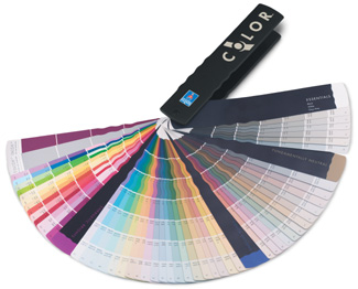
Giving historic color palettes as a guideline can be helpful to get property owners started, many companies have a preservation palette:
- http://www.sherwin-williams.com/homeowners/color/find-and-explore-colors/paint-colors-by-collection/historic-collection/
- http://www.valsparpaint.com/en/explore-colors/find-ideas/national-trust-historic-colors/georgian.html
- http://www.benjaminmoore.com/en-us/for-architects-and-designers/color-gallery#&ce_vm=2&ce_col=HC
__________________________________________________________________________________
A collection of vintage architectural trade catalogs about paint and interior decoration can be found here:
Paint and Interior Decoration: a Catalog History: www.pinterest.com/opa1949/paint-and-interior-decoration-a-catalog-history