Rendering to Reality: Sign Materials & Fabrication
August 2017 Main Street Matters
Article written by Sarah Blankenship, Project Design Assistant, Texas Main Street Program
Main Street design staff has created thousands of renderings that include signage. We have toyed with the idea of taking signage services away for many years because it goes beyond our main role of preserving the building. However, we have found countless examples of signage that is improperly sized and placed, which significantly detracts from the historic building. In this sense, signage is a vital component in the design process. When a properly proportioned and quality sign is added to a historic building, it complements and finishes off the whole project.
Signage is the “jewelry” on the façade. In the bigger picture, Main Street is more than just the historic buildings. It is about making a community
thrive again, and small business is a huge part of that success. Signage is essential to the image of a business; it is often the first impression a
customer has. Recently Main Street design staff, Sarah Blankenship and Marie Oehlerking-Read, visited two sign companies to better understand
modern materials and processes being used in the signage industry to better align our services with the reality of the production world.
In March of 2016, design staff provided renderings for the Park Plaza Hotel in Seguin illustrating appropriate placement and size. The signs were executed almost exactly as the renderings depicted. We asked Seguin’s Main Street Manager, Kyle Kramm, where the sign was made, and that led us to our first site vist at U.S. Signs in New Braunfels.
DEPTH IS KEY
On the next page is US Signs’ mock up for the Plaza Hotel sign. Depth is a very important factor in signage that can often times help convey quality of the sign itself and the business. Note in this mock up the dimension details for the letters. The letters are 1/8 inches three-dimensional router cut aluminum letters, and they are attached to the sign cabinet with studs. The aluminum letters are painted white with an automotive grade paint.
In the actual photograph of the signage, upper right, the depth on the vertical blade sign and canopy sign is apparent. Note the shadows (a primary indicator of depth) made by the letters, logo, and decorative details by separating them from the background. The studs (pins) that attach the letters to the background are typically ¼ inches. The pins provide another important role—preventing streaking. By separating the letters from the
background, rain can flow in between. Any paint runoff or rusting by adjacent materials is avoided by the separation.
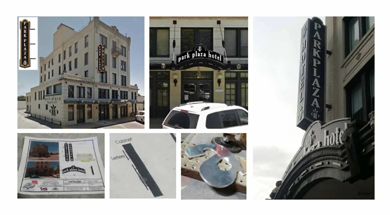
(Top images) Main Street design staἀ renderings. (Bottom left and middle) Sign company Park Plaza Hotel with new signage installed.
rendering and speciḀcations. (Bottom right) Router cut metal letters.
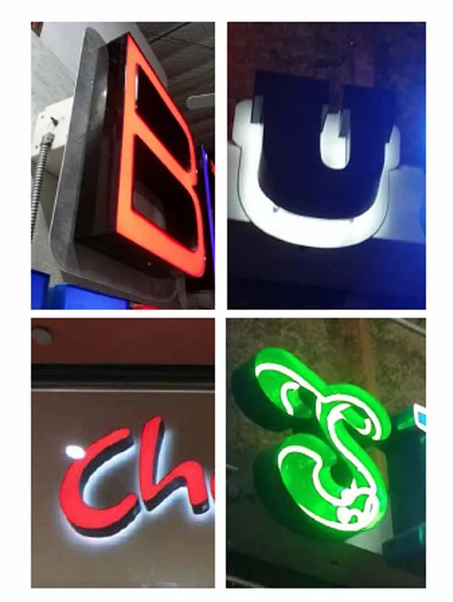
(Top left) front lit (not recommended), (top right) reverse lit (recommended), (bottom left) front/back lit (not recommended), and (bottom right) open face (appropriate on case by case basis).
CHANNEL LETTERS, MORE DEPTH AND LIGHTING
Channel letters are a very common sign type today. In general, they are more appropriate to strip centers, but we are seeing more of them in downtowns. How do we bridge the gap and choose what is appropriate for Main Street cities?
First, we need to understand what channel letters are. Channel letters are separate pieces of sheet metal that are welded/attached together to make three-dimensional letters. They get their name from the internal “channel” contained within each letter. The internal channel is where the lighting components are located. Today, there are four basic configurations: front lit/standard, reverse lit (or halo lit), front/back lit, and open face. Main Street Staff does not deem front lit letters appropriate for historic downtowns because the light is too glaring and bright. In general, an indirect source of light should be used. Spot lights that are completely separate from the sign are appropriate. If lighting the letters is still desired, staff
finds reverse lit channel letters appropriate. Open face can be appropriate on a case by case scenario if exposed neon is used.
In the close-up side views of U.S. Signs monument signage below, notice both the separation from the background and the depth of the letters. In comparison to the Park Plaza Hotel, these letters are very deep. 5 inches is a standard depth for channel letters. This standard depth comes from the history of their use with neon signs.
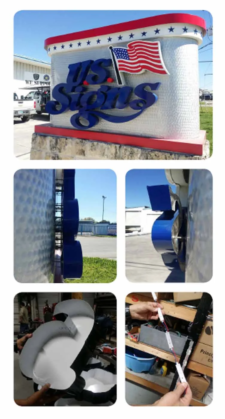
(Top) Monument sign in front of U.S. Signs. (Middle images) Side views of channel letters showing studs and LED lighting. (Bottom left) Basic channel letter form. (Bottom right) Strip of LED lighting.
From our Main Street design perspective with signage on historic buildings, we typically find that 5 inches channel letters create a letter that is too bulky and detracts from the building. Most downtown commercial buildings are one to two stories and 25 feet in width. The architectural detailing typically projects in smaller increments. For example, brick corbelling would step out half the brick width or less, which is only 1.8 inches. If these 5 inches letters are going on a very large building with many stories, it will not be as big as an issue because the higher the letters are, the smaller
they will look. We inquired if sign companies can make channel signs with smaller widths. The answer is yes, and 1 ½ inches to 3 inches was recommended. Therefore, our recommendation to business owners with a typical downtown building is to inquire about channel letters with a smaller depth when looking into fabrication. Likewise, request that the cabinet (what the sign is mounted to) have a shorter depth to decrease the
appearance of bulkiness.
LIGHTING
Today, LED lighting has become the common lighting source. It is less expensive, lighter, easier to attach, and does not break as easily. The LED bulbs also last longer than other forms of lighting. It is commonly used in closed face channel letters. The strips of light are attached to the back side of the channel letter or the side walls. The thinner the channel letter, the more “hot spots” the lighting can make. If you are considering a 1 ½ inches to 3 inches depth channel letter, the LED should be located on the side walls to decrease hot spots. LED is not used on open face signs. This is because it is not one continuous tube of light, but rather rectangular units with pinpoints of light with wiring in-between, which is not aesthetically pleasing. Neon on the other hand, is a historic sign method that does have the continuous tube of lighting and works well with open face channel letters.
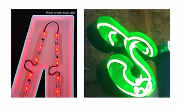
(Left) Letter LED lights lit. (Right) Neon in open face channel letter.
While LED is very popular, there is somewhat of a neon resurgence happening, which led us to our next sign company, Custom Sign Creations (CSC), in Austin. Neon signs are made with glass tubes that are blown into the specific shape of the business’ name or logo. “Neon Signs” derives from neon being the original gas used to light the tubes. Several other gases have since been used along with different tints and phosphor coating for the glass tubes that produce a variety of over 50 colors. For example, helium creates yellow, carbon dioxide is white, and mercury makes blue. A high-voltage electrical current is passed through the gas and the tubes emit light.
CSC conveyed to us that there is a misconception that neon is not energy efficient, in fact, they consider it more efficient. Neon signs in the past have been temperamental and short easily, leaving non-lit signs. However, new technology has changed that. Transformers now have a ground fault projection that allows the sign to come back on when it is dry. The transformers have helped take away the audible hum of older signs. There have also been advancements in keeping water out of the housing. Both lighting types can be used in historic downtowns. It just depends on the signage design and local ordinance.
NEON signs from CSC’s Sign Gallery.
CARVED FOAM
Until now, the article has focused on metal, based on the course our Park Plaza Hotel signage took us. However, Styrofoam is another option to consider. Historically, wood was carved to create beautiful three-dimensional signs. We were told that good quality wood for this purpose is getting harder to find. High density foam is now the common material used to create effect of carved wood using a router. The background can even be given a wood texture. Carved foam is a great option to give a sign more depth while also maintaining a traditional appearance.
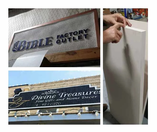
(Top left and bottom left): Styrofoam cut signs, (Right) High density foam before
cutting.
Thanks for joining us on our sign company visit adventure. There is so much to learn and share, but we’ll stop here for now. Preservation Brief #25 includes additional history and preservation of signs. Keep in mind that signage is often your business’ first impression. It should not be an afterthought. Carefully consider what fits on your building and what materials would work best to make your businesses stand out for the right reasons.